The Derma Company
-
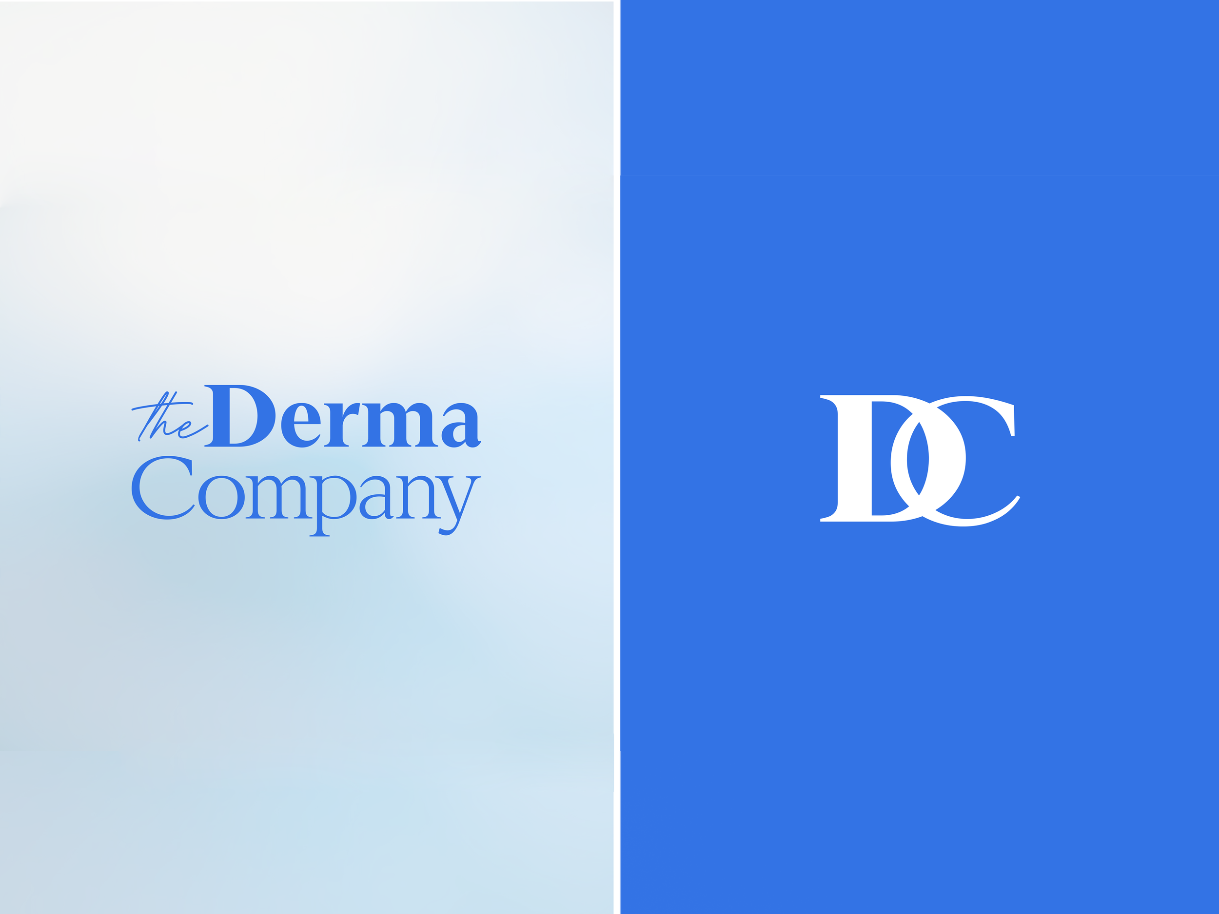
The Derma Company
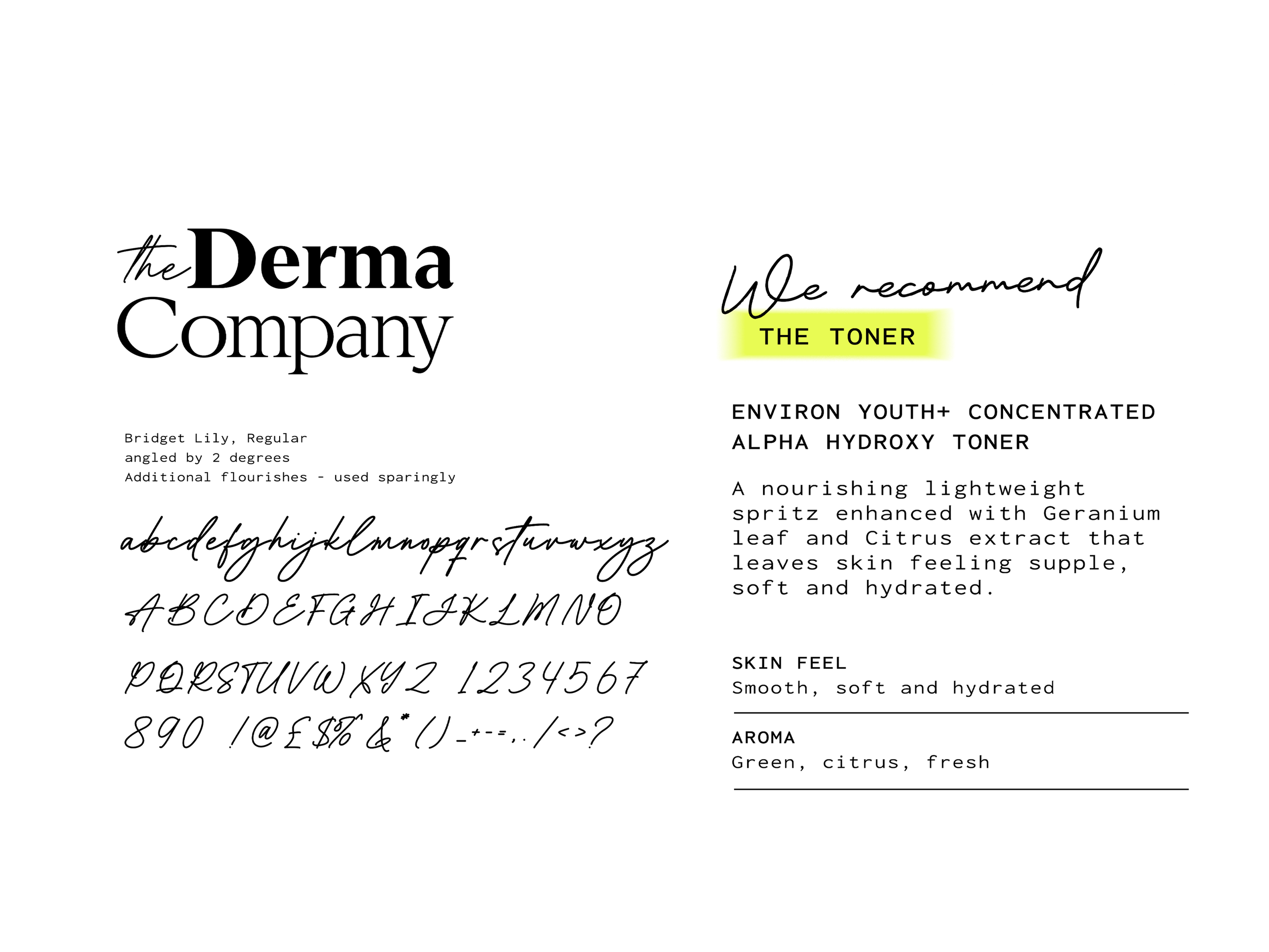
Brand Uplift | Brand Identity, | Typography | Colour Palette | Tone of Voice.
-
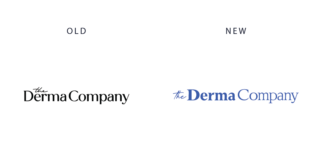
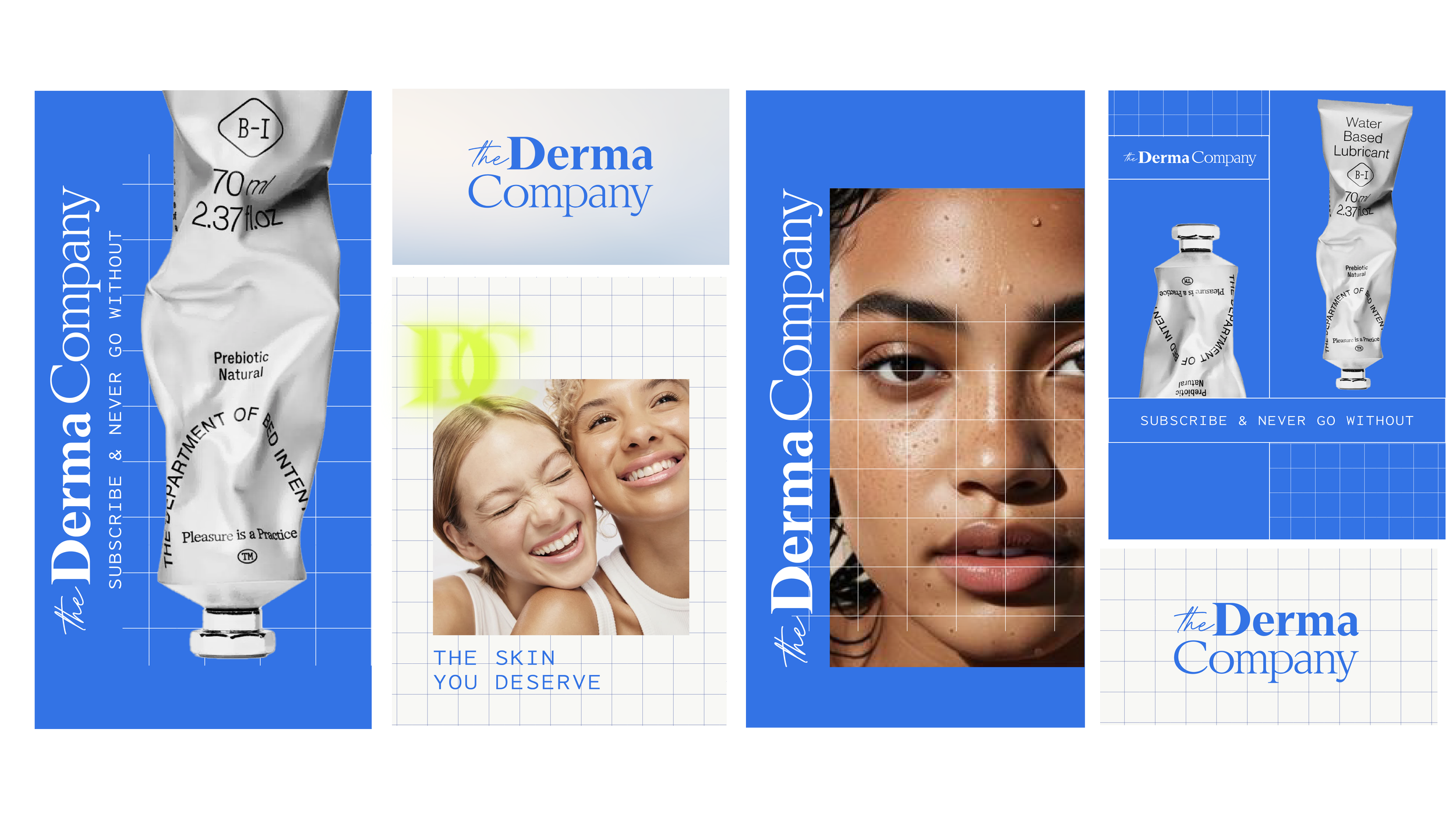
The Derma Company wanted to reinvigorate its brand to attract a younger audience, while still retaining the trust and loyalty of its well-established customer base.
-
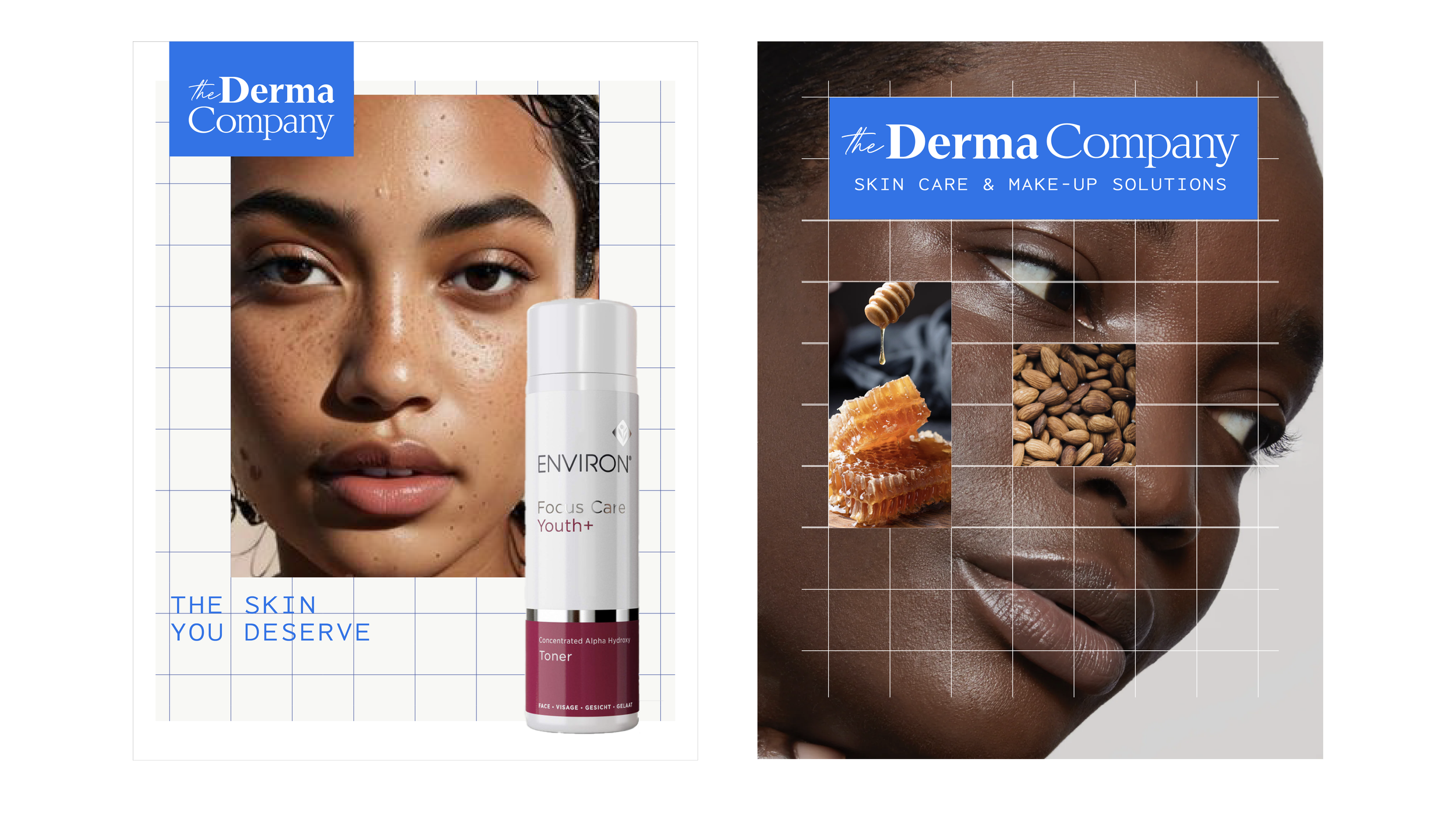
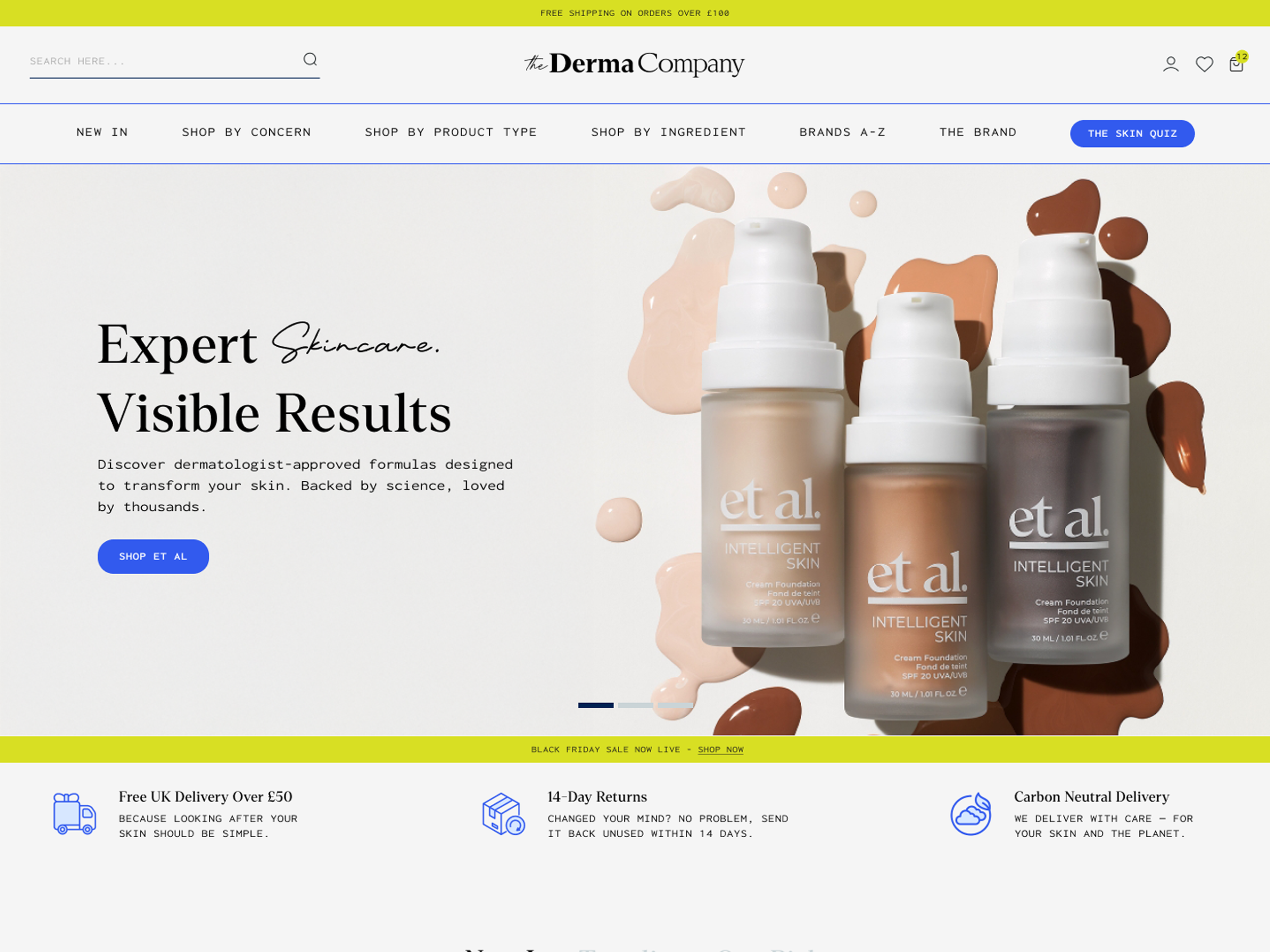
I used the existing brand as a foundation and evolved it into something more punchy and distinctive, ensuring it could stand out within a highly competitive market and appeal to a broader demographic. The refreshed identity needed to remain premium and aligned with their high-end dermatological and makeup ranges, striking a balance between clean and fresh without feeling overtly clinical.
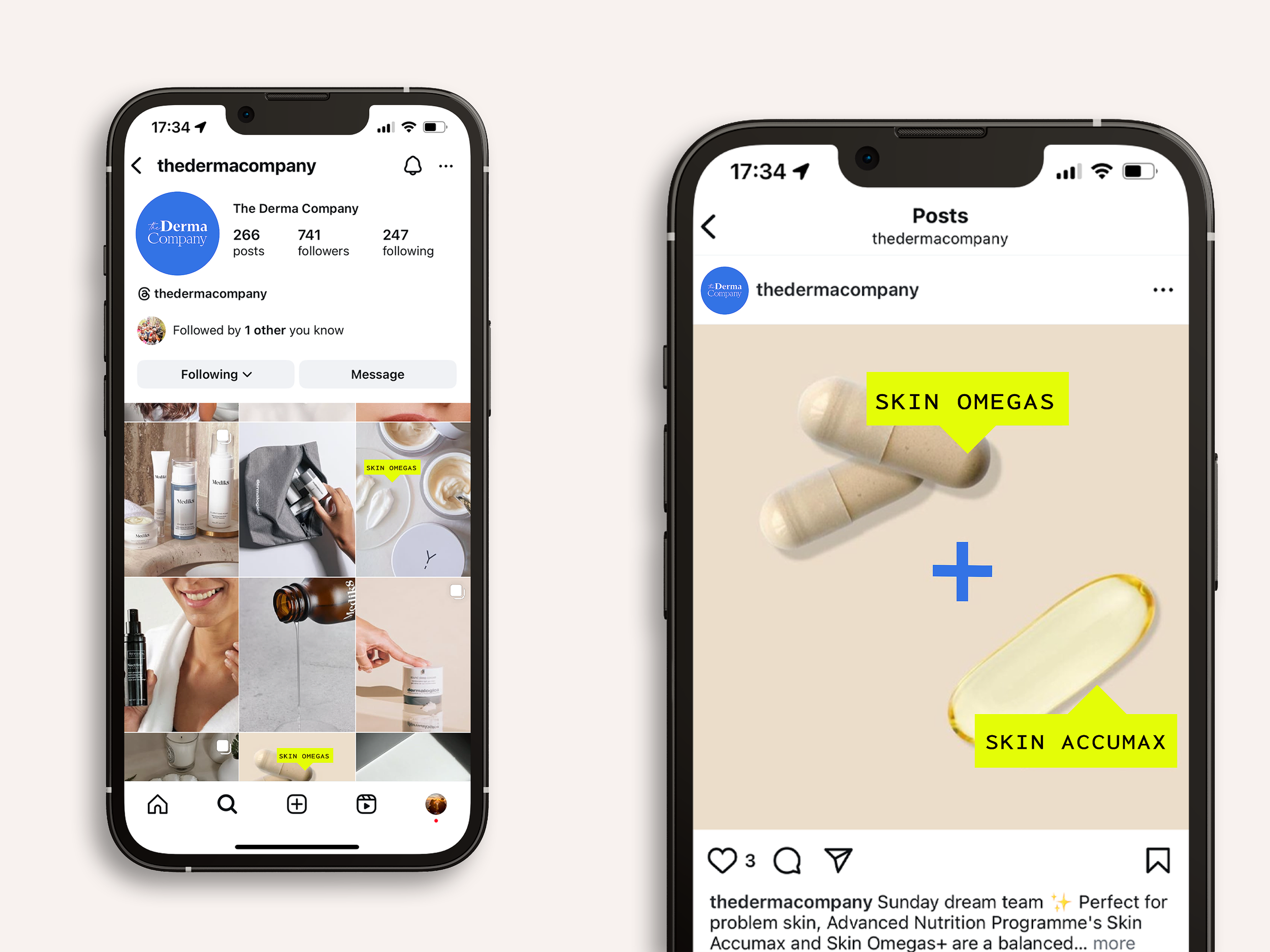
I shaped a tone of voice that felt genuinely knowledgeable yet approachable, positioning The Derma Company as a friendly, expert guide in the skincare space. The aim was to strengthen their reputation as the go-to provider for personalised advice, building on their longstanding experience and customer-focused ethos.
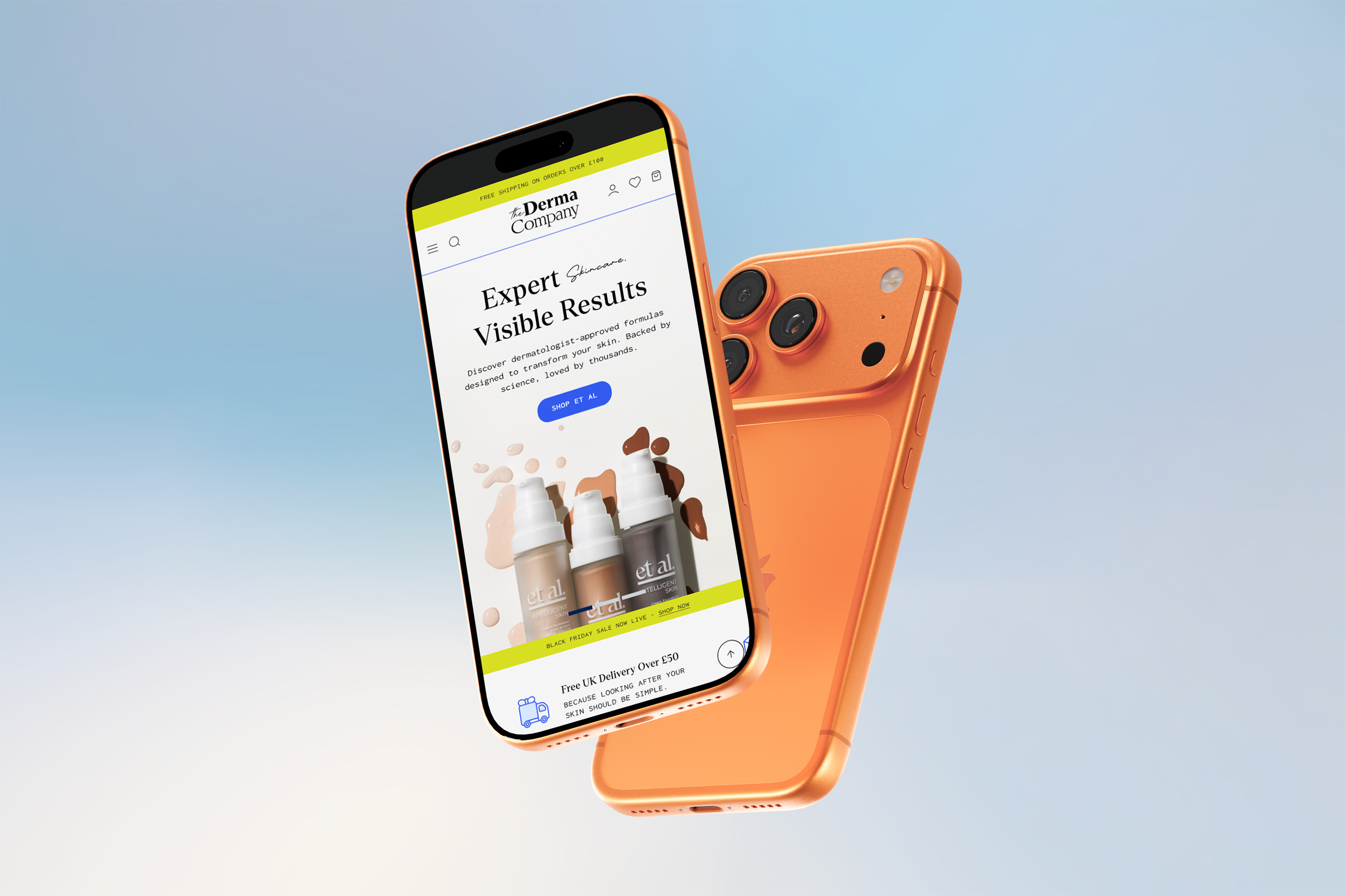
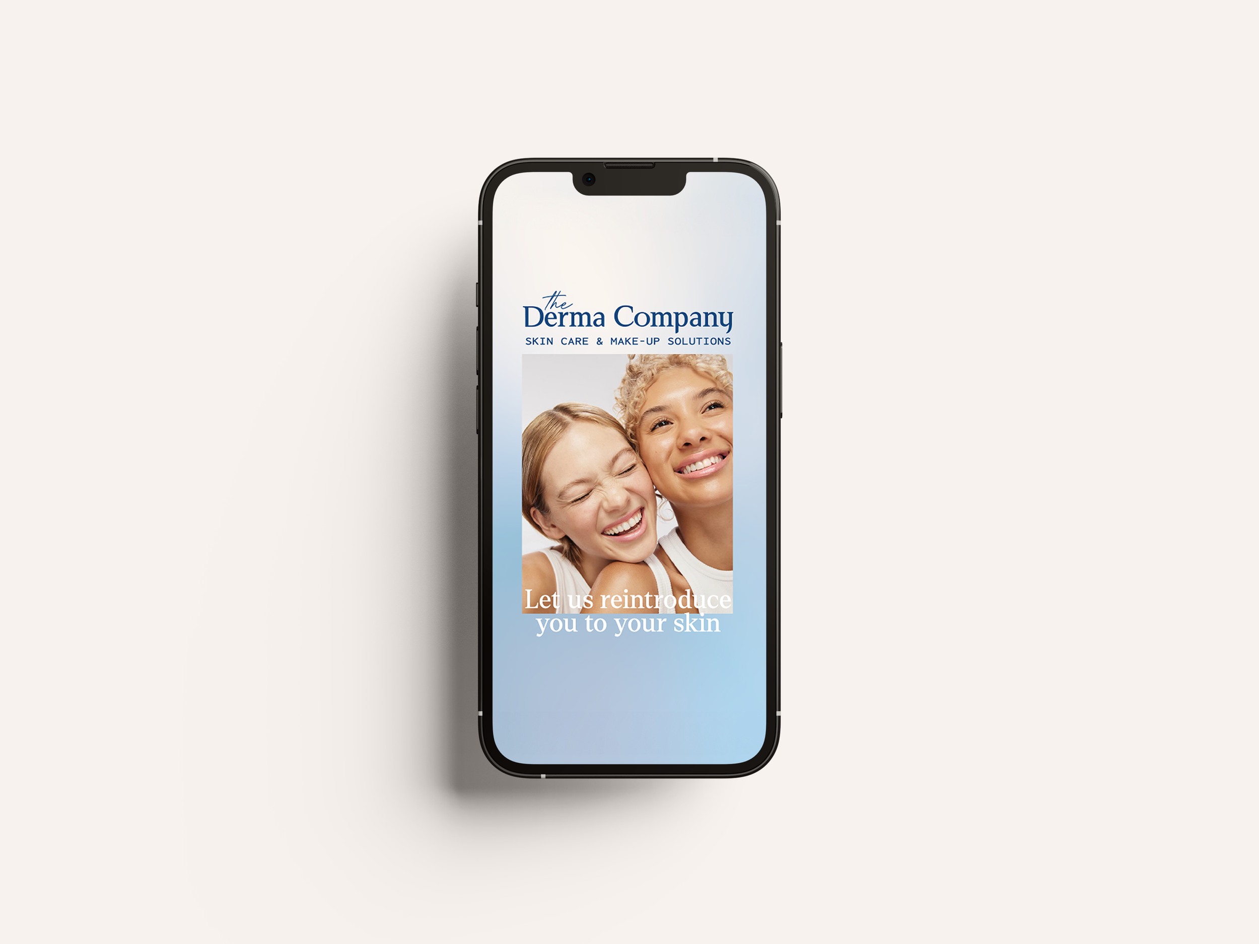
Equally important was ensuring the brand uplift seamlessly translated into a fully updated UX/UI experience, creating a website that reflects the same clarity, confidence, and care as the brand itself.
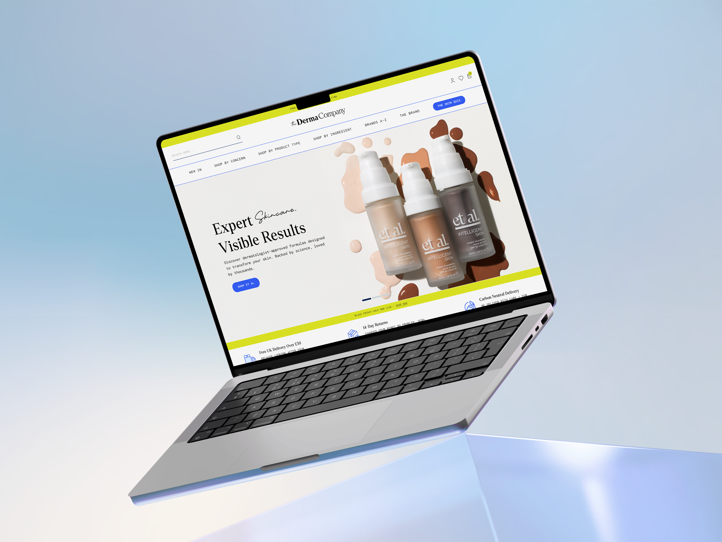
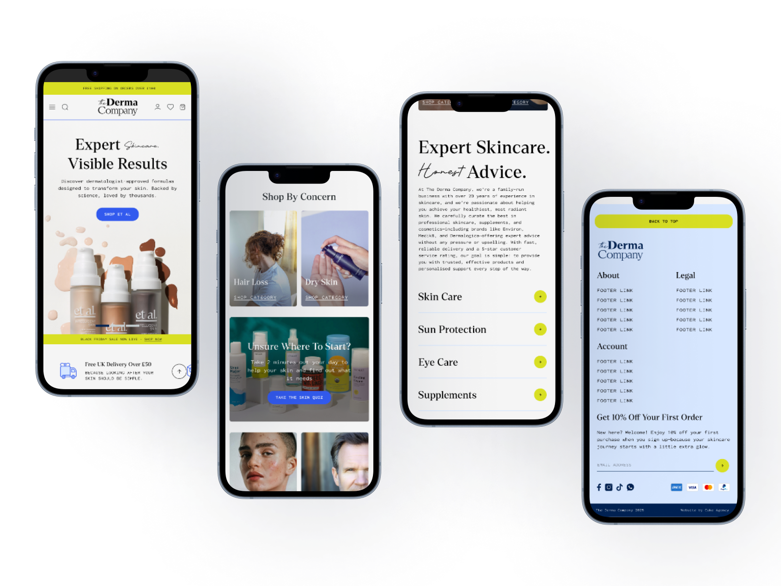
UXUI design by Jess Owen at Cake Agency