Chelsea Baby
-
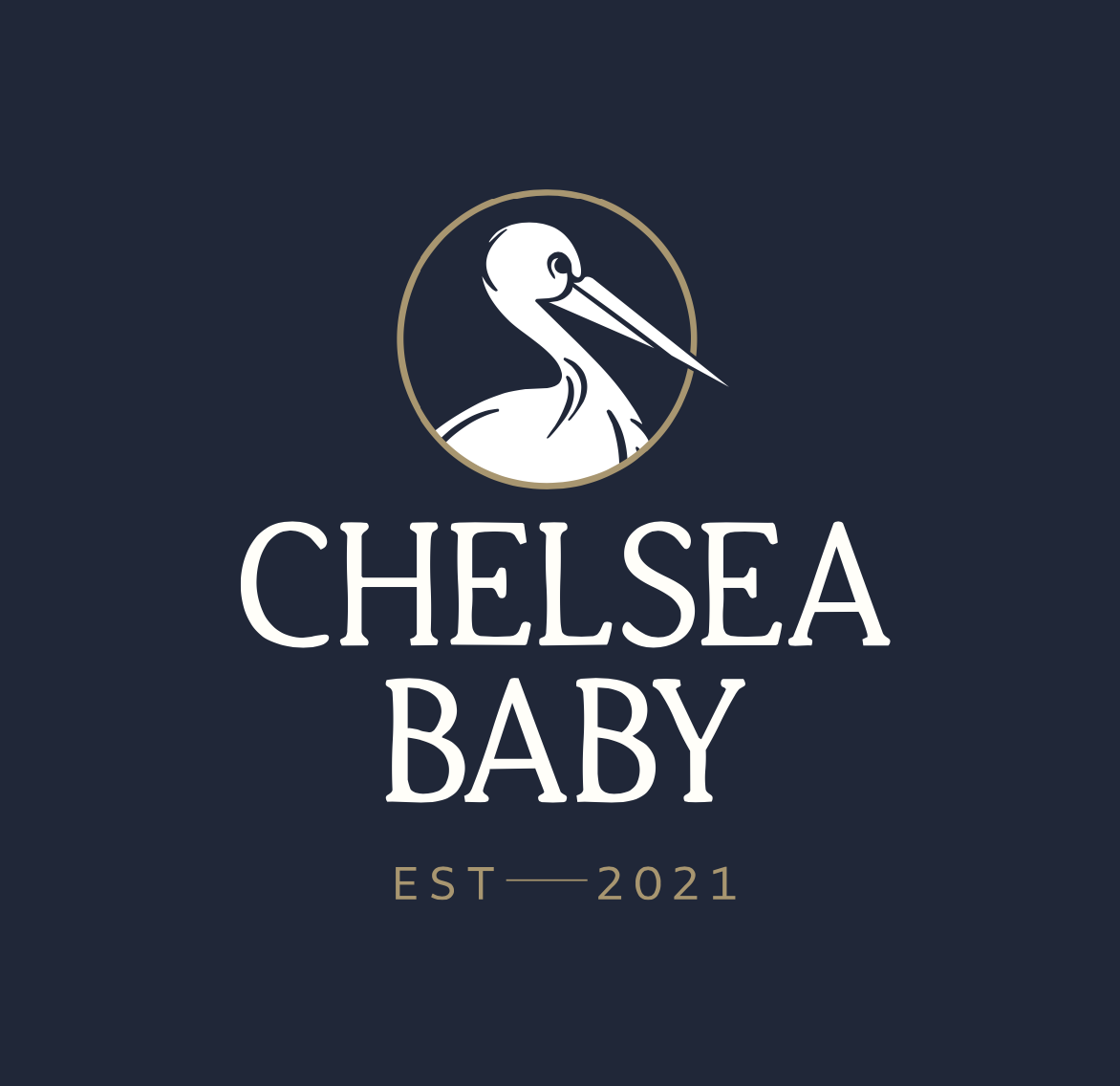
Chelsea Baby
Brand Identity | Typography | Illustration | Colour Palette | Tone of Voice.
-
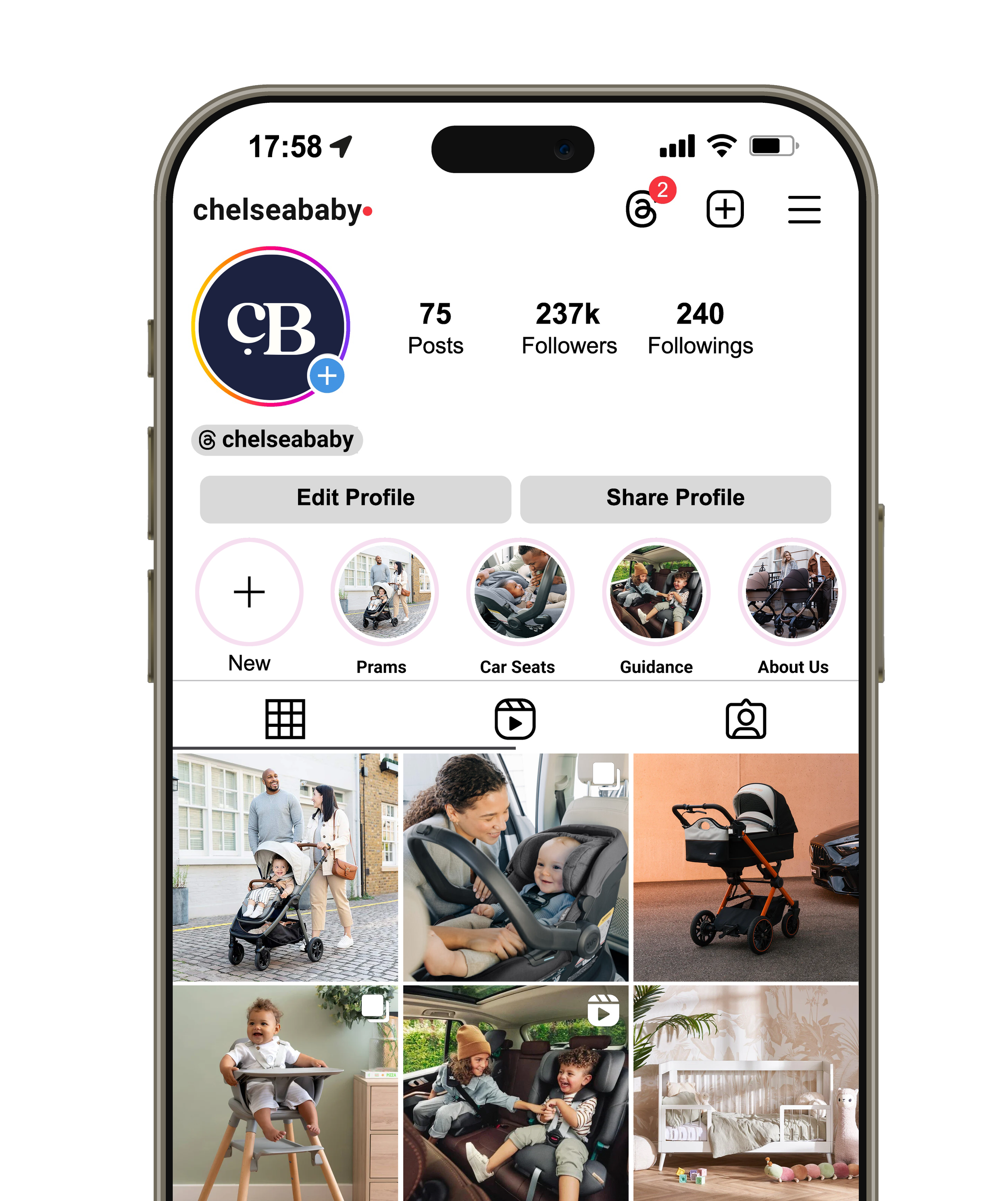
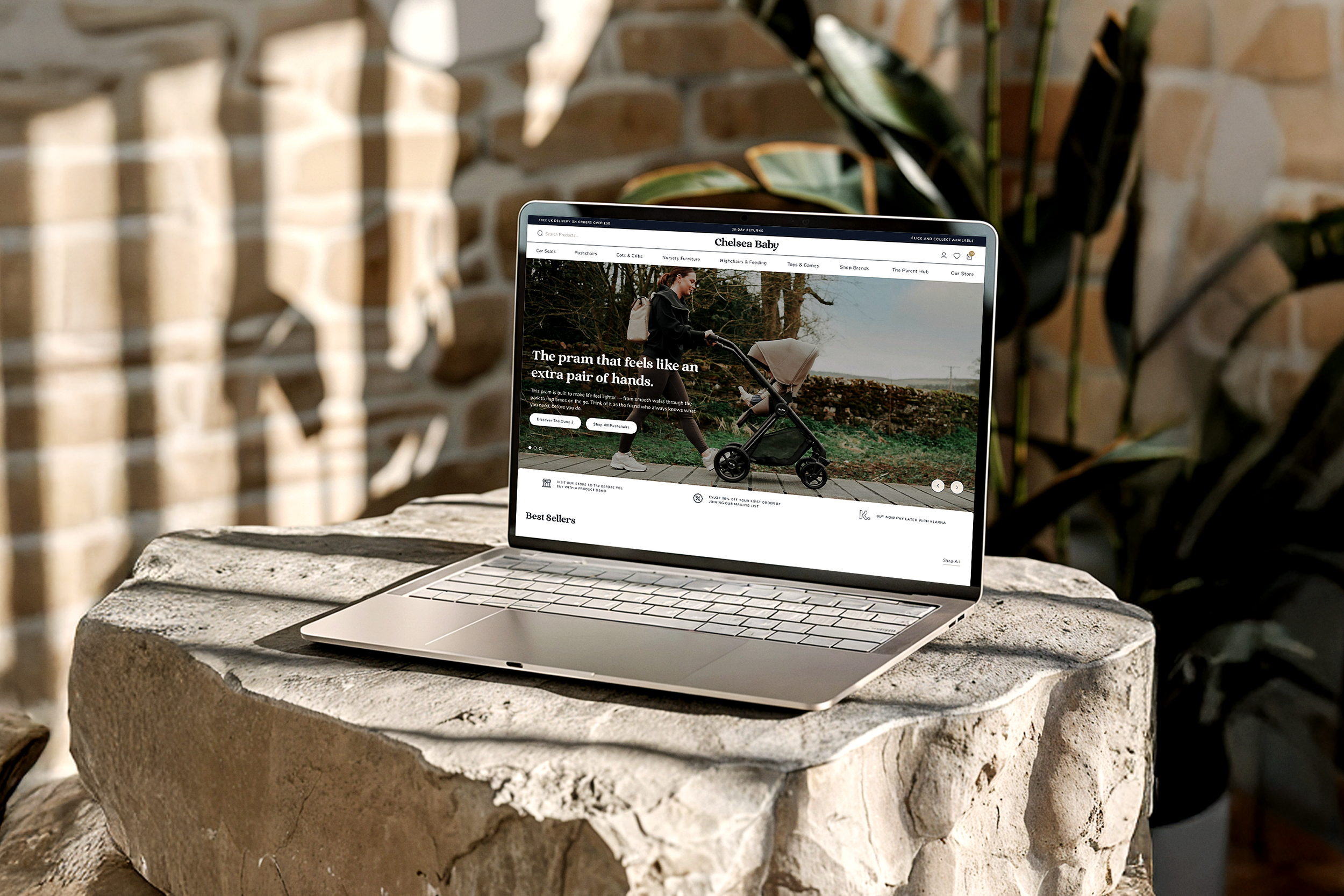
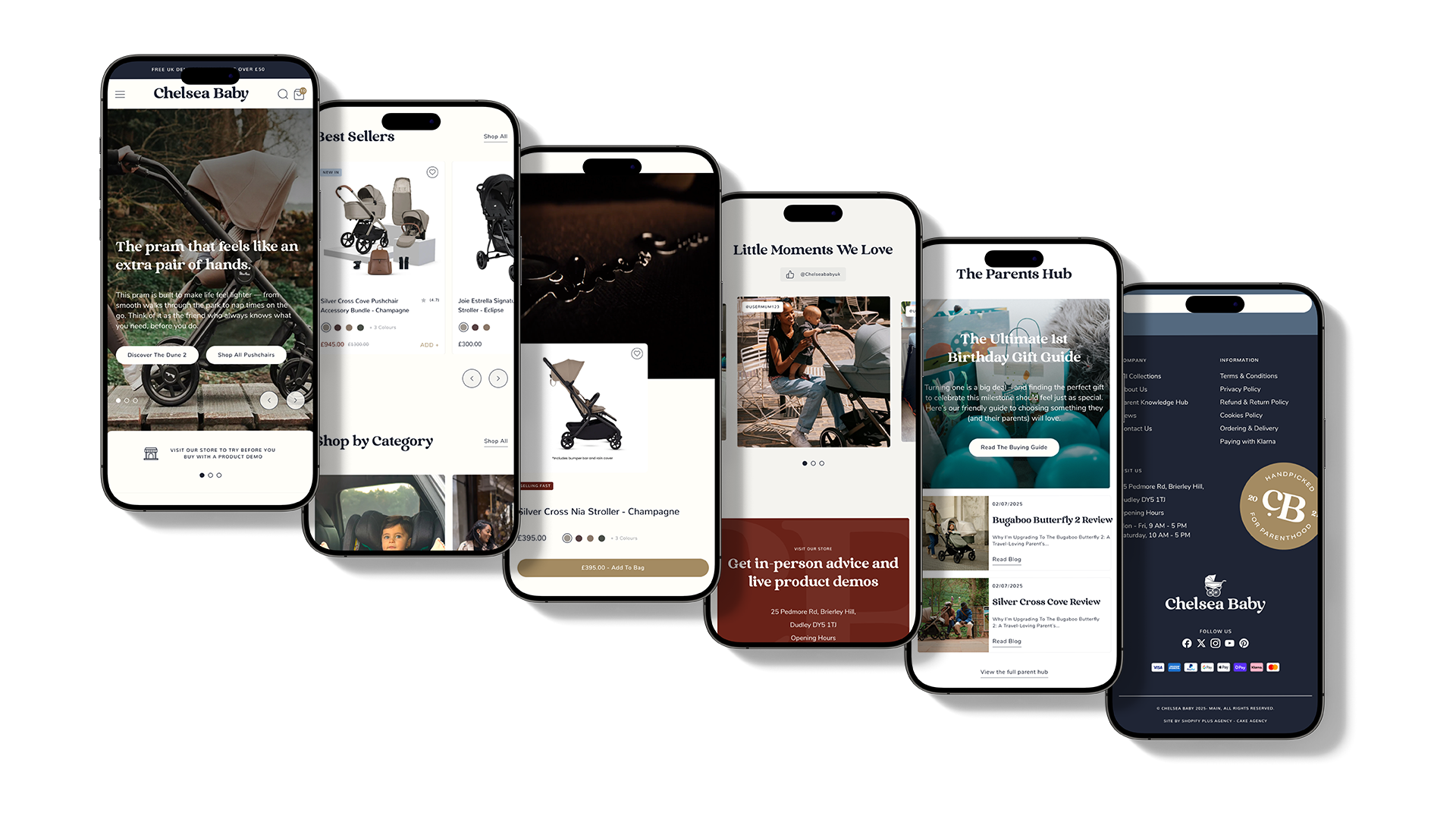
Chelsea Baby, like many emerging brands, entered the market with an identity that didn’t fully reflect its long-term vision. They needed a brand that communicated the exceptional quality of their products and drew on insights from the lifestyle sector to inspire trust and resonate with modern parents. The goal was to create an identity that felt aspirational, authentic, and aligned with the future of the company.
-
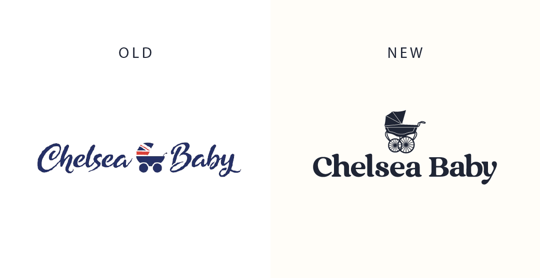
The original branding aimed to communicate British heritage, high quality, and a literal connection to the product range. Although the typography was chosen to feel warm and welcoming, the overall execution came across as cluttered and failed to deliver the level of aspiration the brand wanted to achieve.
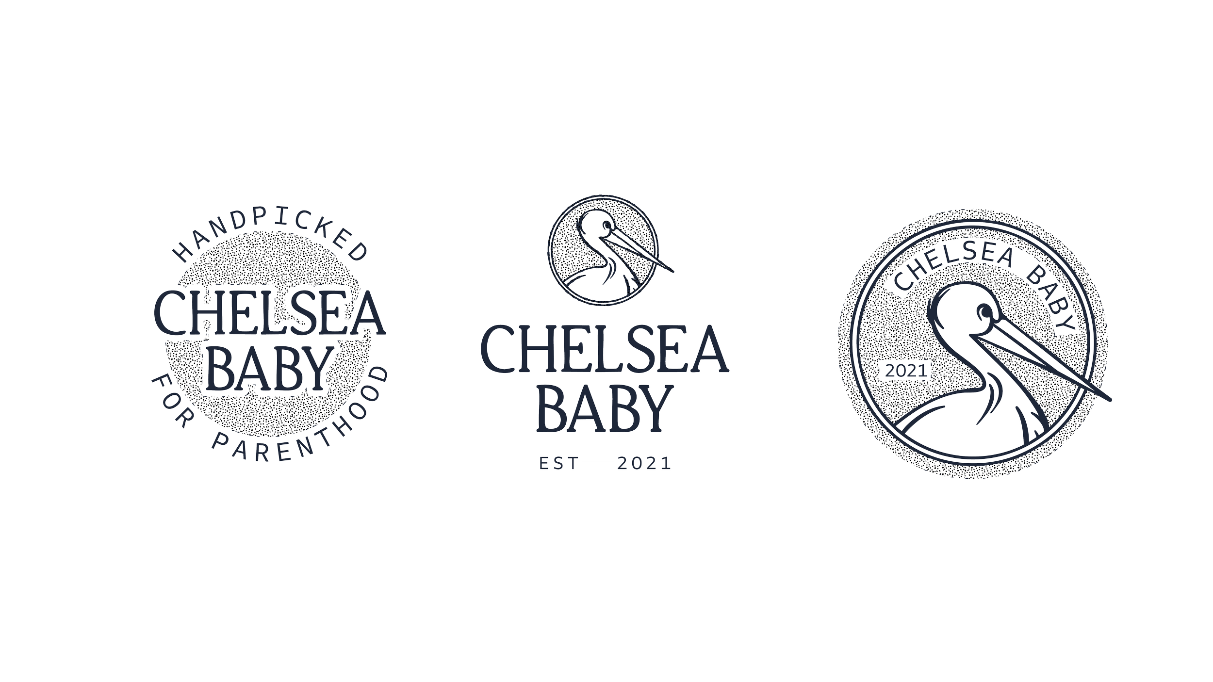
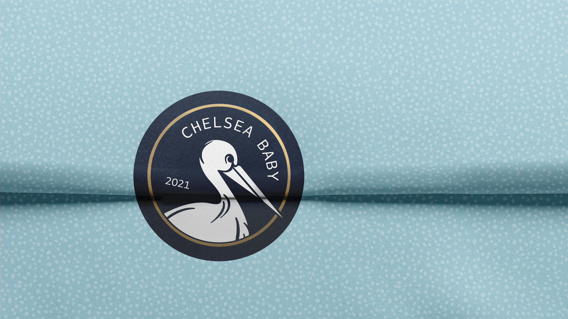
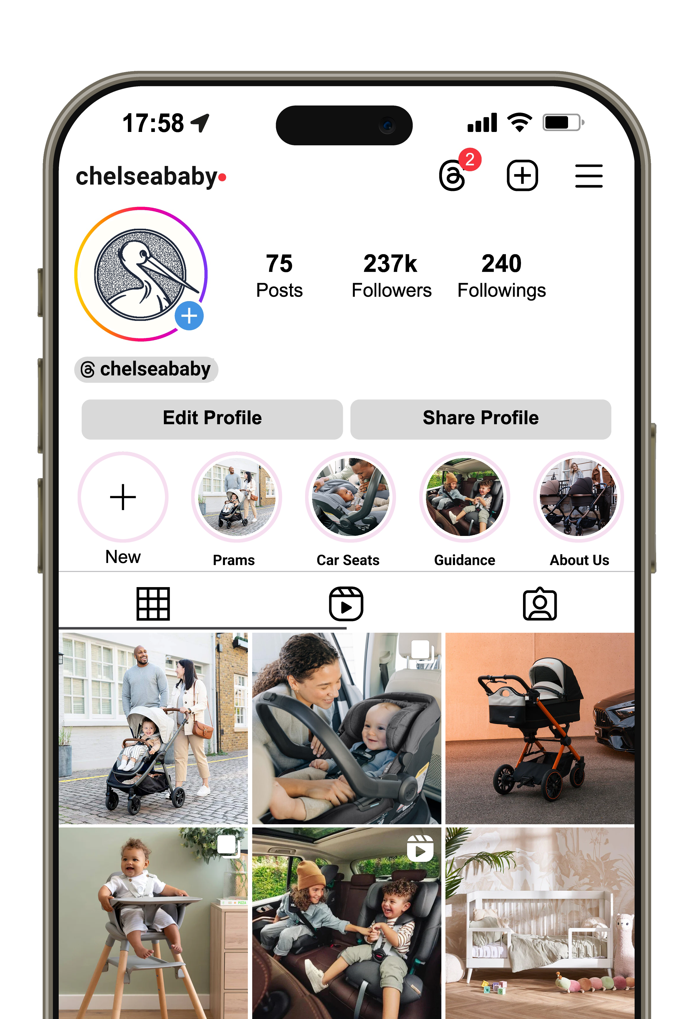
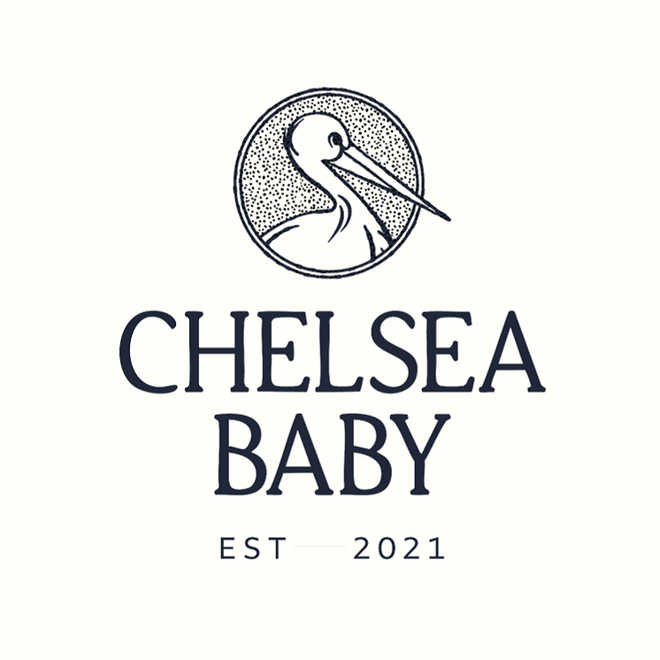
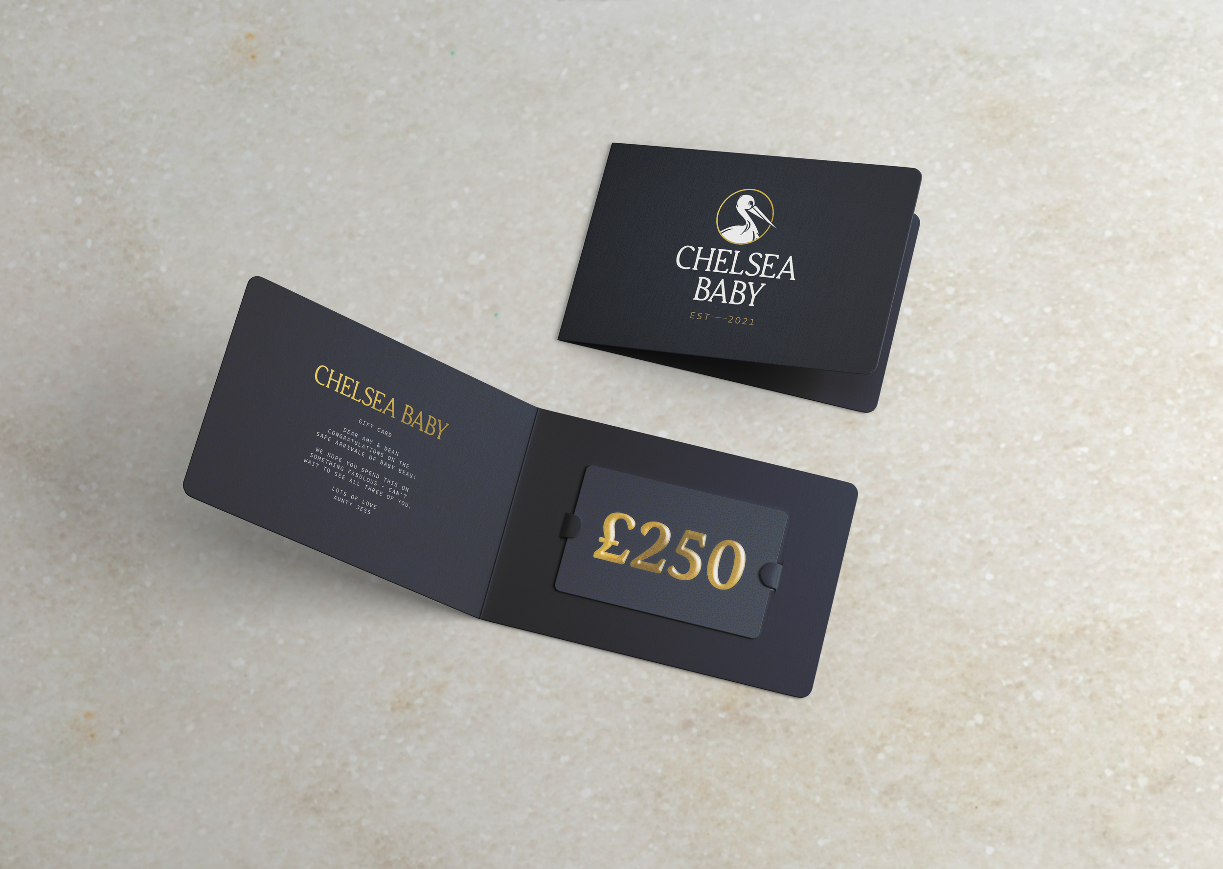
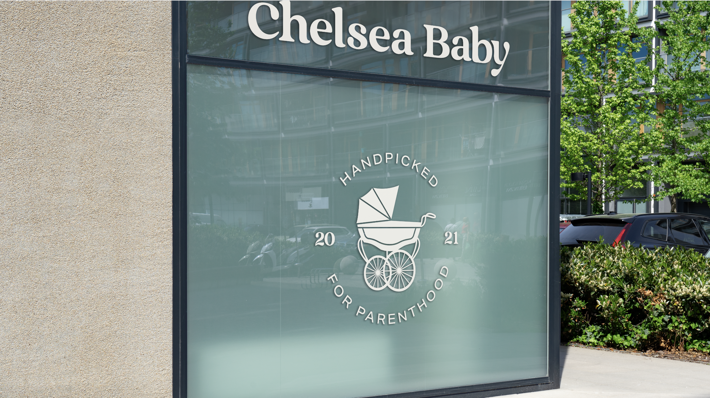
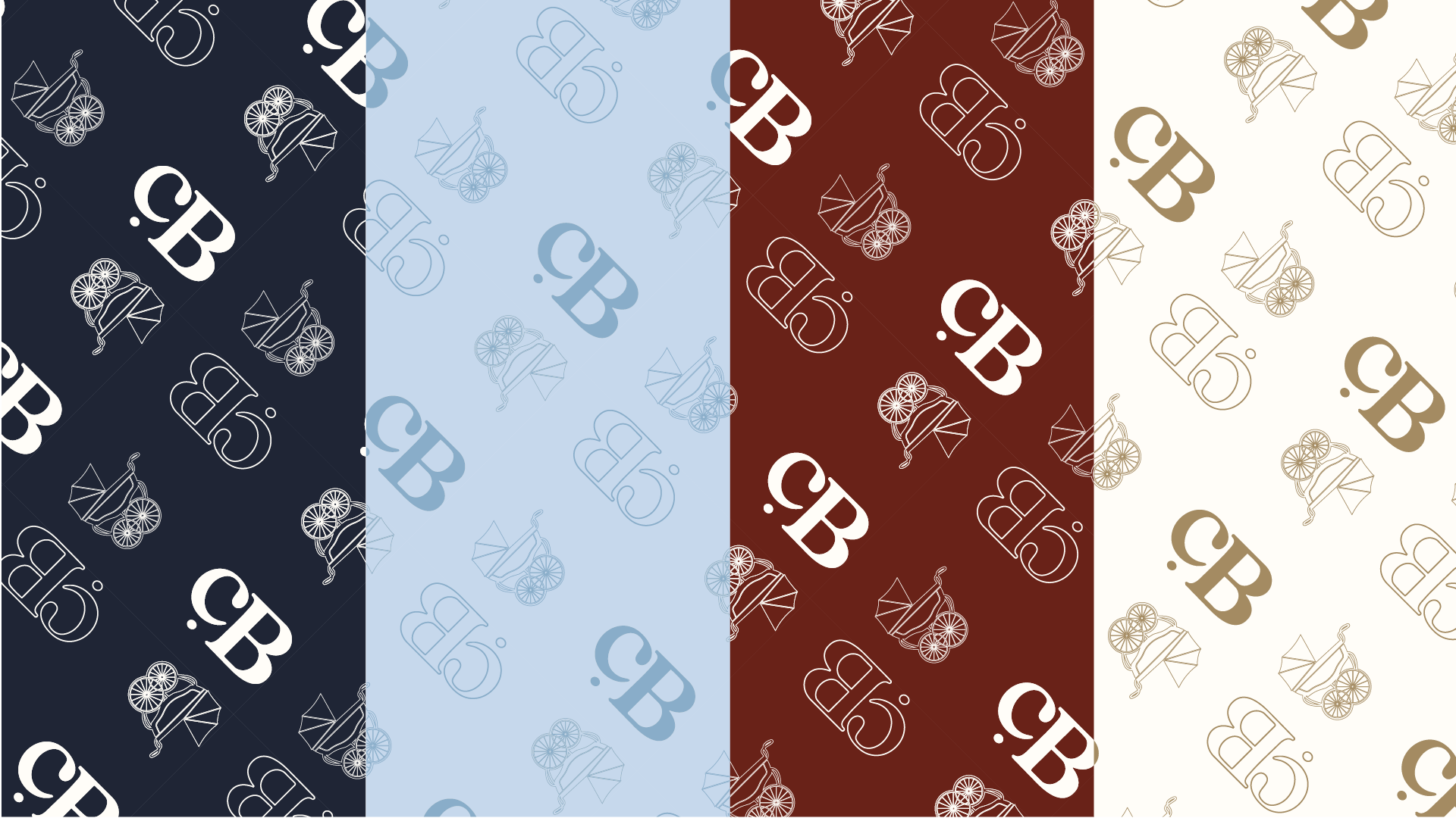
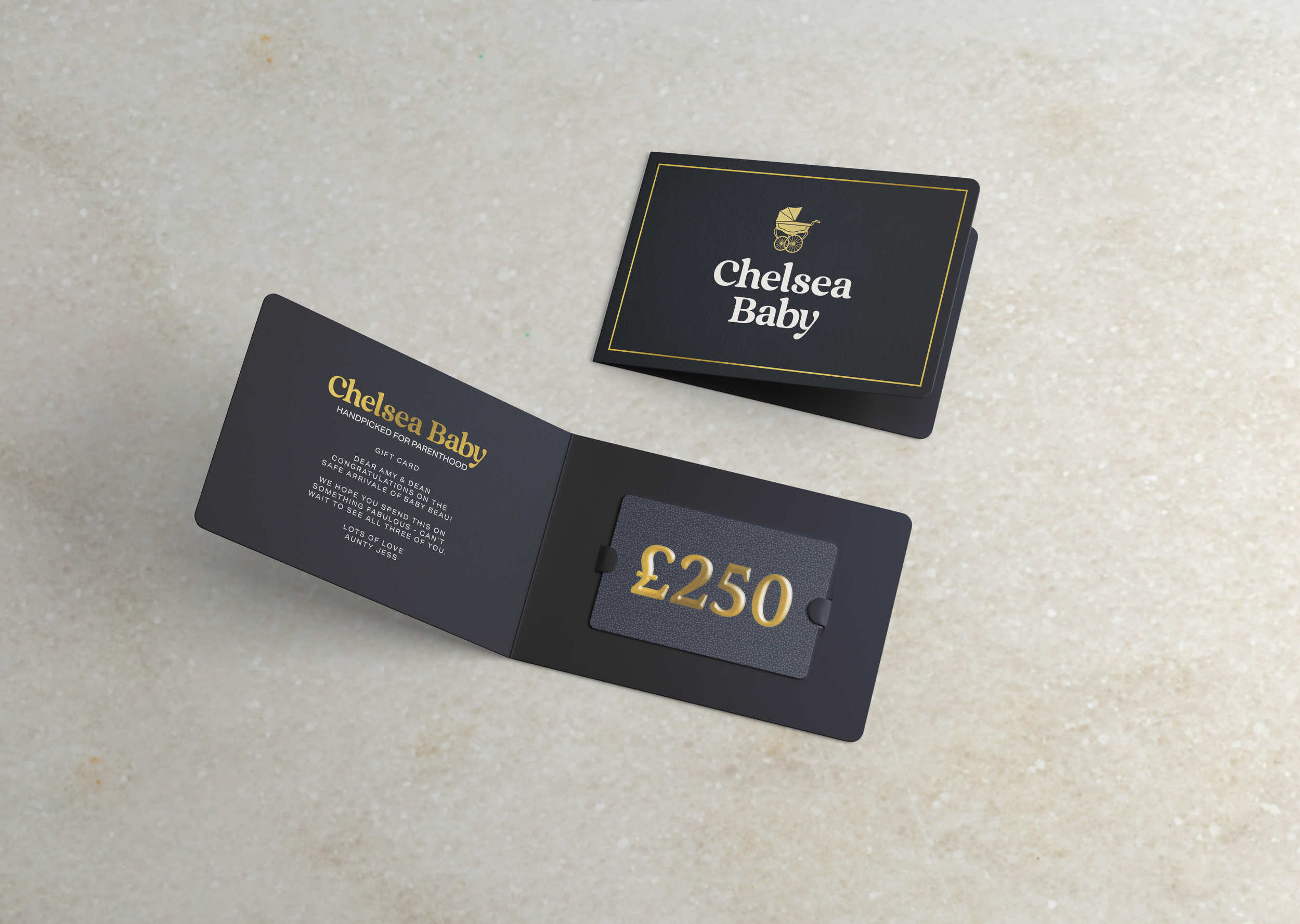
To address this, I developed a bespoke wordmark and illustration system that could flex across multiple touchpoints, from branding and packaging to the website. A richer, more sophisticated colour palette with heritage-inspired tones was introduced to add depth, maturity, and a sense of refined gravitas to the brand.
-
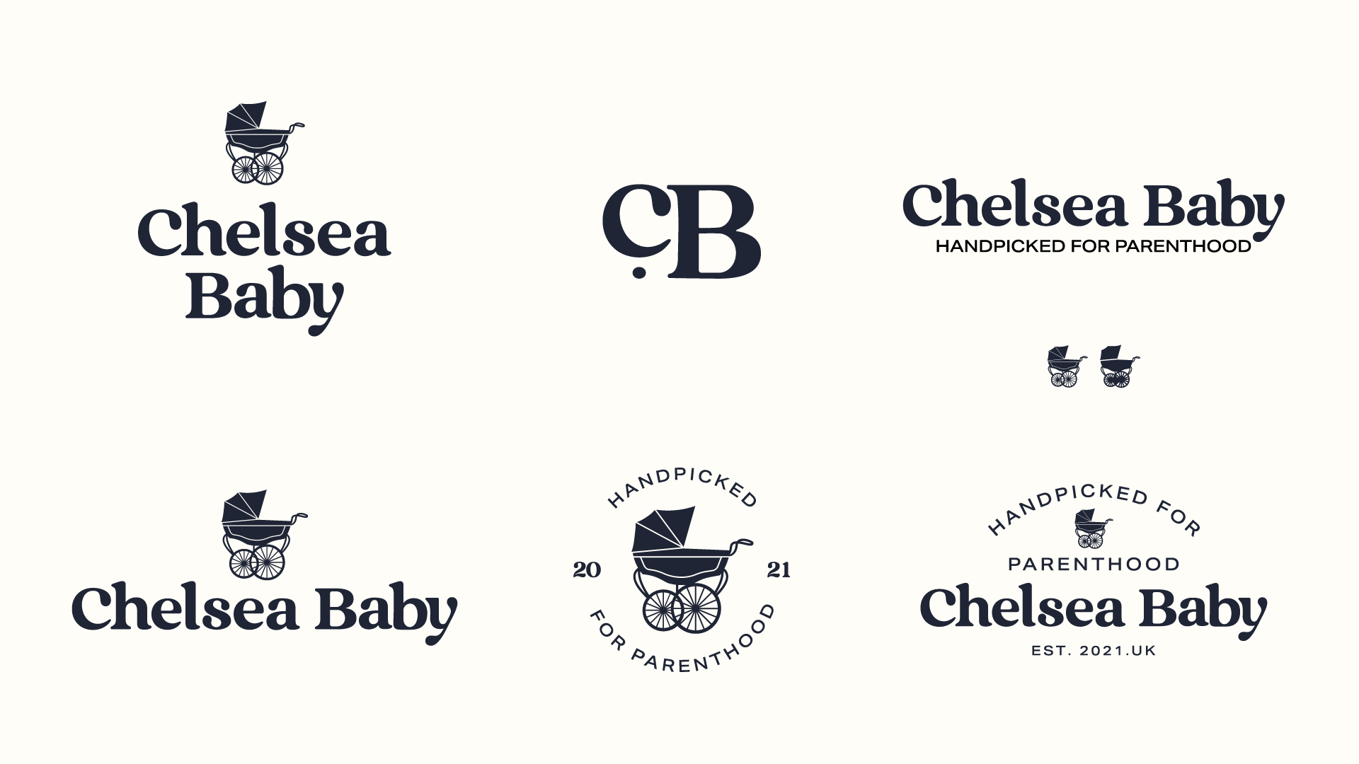
Not all concepts make it to final delivery, but this one had real personality and was a pleasure to develop. The client responded very positively and is considering using it for a future product line.